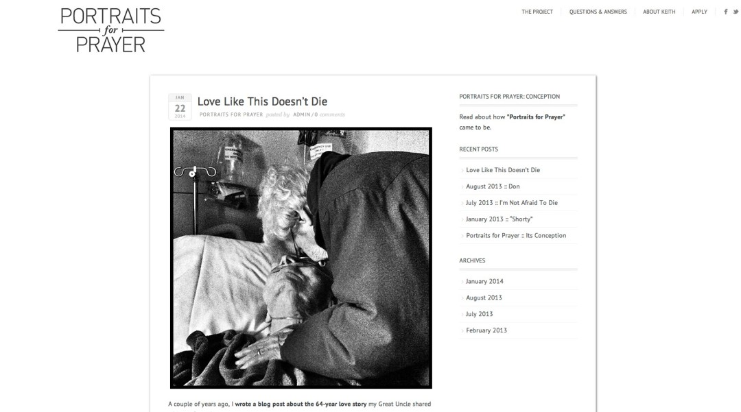
My friend Keith Taylor needed a very simple, elegant site for his Portraits For Prayer project. Keeping the page minimalist in design as well as the constant white background, the black and white images that Keith created really pop.
I was even featured on the site.

