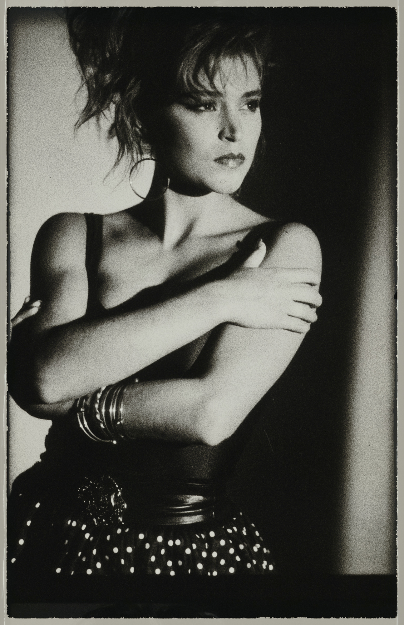
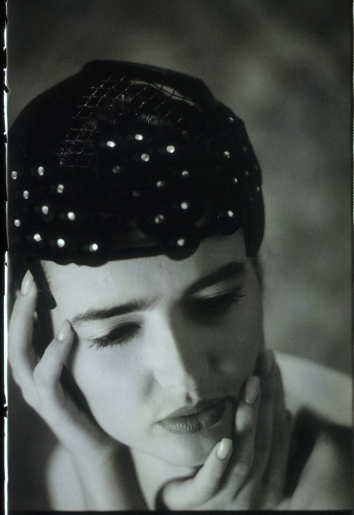
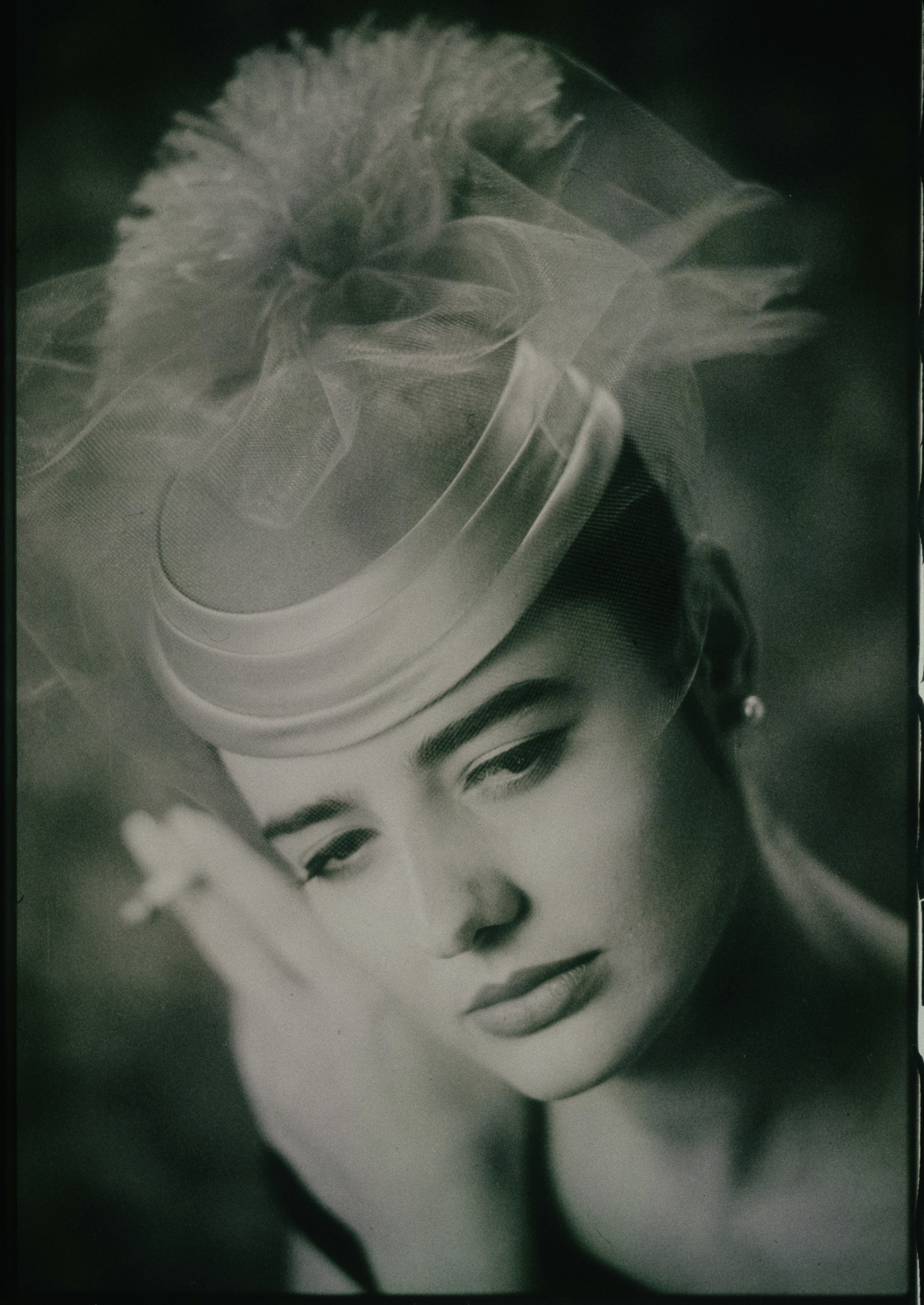
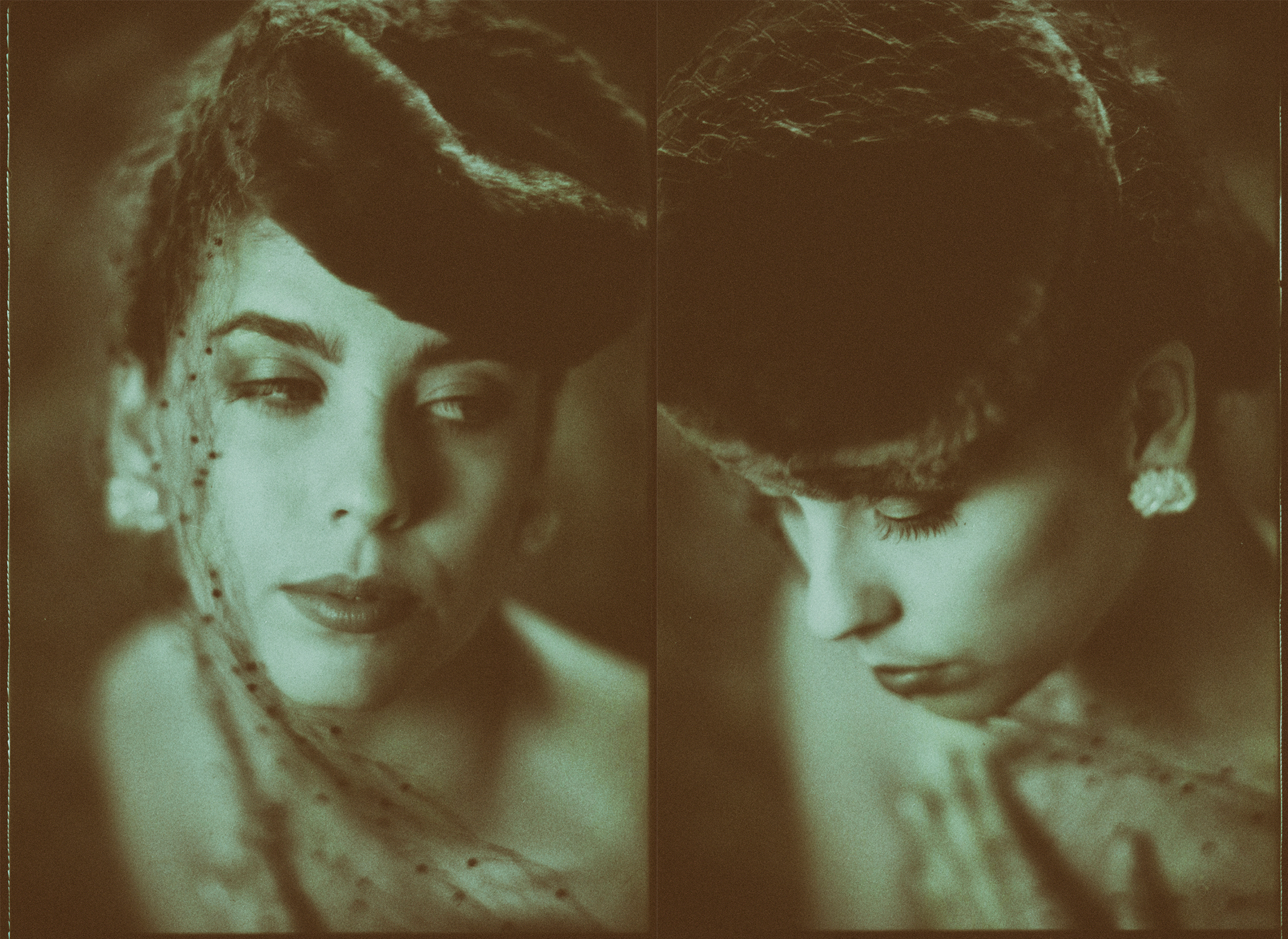
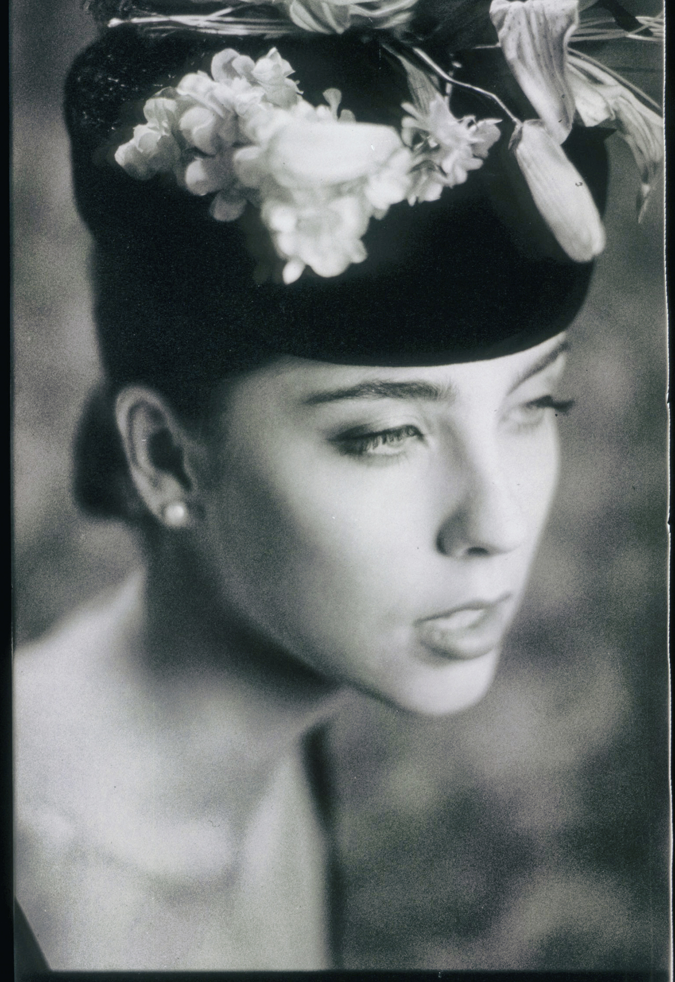
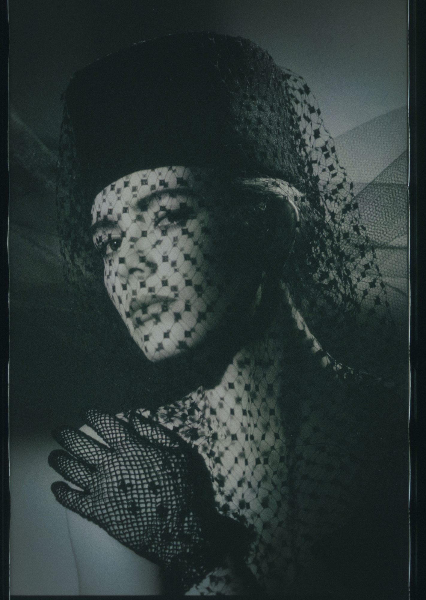
POLAROID PORTRAITS CA/ 1985
One of my favorite films... but it is now gone.Back in the mid ’80s, I was shooting a lot of fashion and beauty work in my Phoenix studio, and occasionally in New York and Chicago. Those were heady times with shoot schedules coming back to back for weeks and months at a time.
My work at the time was mostly focused on black and white or monochrome, and I would shoot hundreds of rolls per week. This meant, of course, that I had to have a full-time darkroom assistant whose main job was to develop, contact print, and manage a lot of film. We used glassine holders, and archival sheets designed to hold negatives and would allow us to make contact sheets without exposing the film to the elements.
Around that time Polaroid came out with a very cool film. Well, at least I thought it was extremely cool. It was called Polapan. It was a black and white transparency film that you could develop instantly… and it was gloriously awesome.
This film had a tooth to it, a grain that was unlike any other. It was contrasty, yet very lovely through the mid-tones. It didn’t look like TriX or Plus X. It looked like its own presentation.
And to be sure, this stuff was a pain to handle. You had to buy a developing tool that would wind the film into the dark through the developer cartridge. You would let it sit for the required few minutes, then roll it back out of the little device. And it would still be wet, and fingerprints would show.
It would also scratch if it touched anything in the real world. I think it would scratch if you even thought about it. I would hang it in dust-free areas, or in bathrooms full of steam so as the steam settled the film would dry without dust.
If I was shooting in the field, I would wait — well usually — until I got back to the studio to develop. I did this myself, not the studio assistants. I would be responsible if it was damaged or scratched, not an assistant who would feel bad about doing it. If anyone is going to FIU, it would be me.
I shot roll after roll of this stuff. I loved it.
The images here were from outtakes for an assignment on antique hats* and these are scans from prints.
Ahh… prints.
These are transparencies, so if I wanted a print, I would have to get a “Type R” from the lab (a color process that made images from transparencies) or use a slide duplication tool to get a capture on traditional black and white film. This was not the ideal way because I would introduce Plus X grain into the Polaroid grain. I wanted the look and feel of the Polaroid to stand out.
The answer was Cibachrome.
I would use Cibachrome to make the prints, and since it was a color paper I could introduce slight tints to the images through the enlarging process. A very light blue paper that once wrapped around a cigarette pack, or some cellophane that had yellowed with age. I tried so many things, then cataloged them in manila envelopes for continued use.
As I noted earlier, most of my work was in monochrome. In fact, my entire portfolio was monochrome… not necessarily black and white, but decidedly two-color. I would bleach, color tone, split tone, and use specific toners like Selenium at varying strengths to add a very slight color to my prints.
I miss those days. But I love my digital cameras as well.
As you can see, even back in the 80’s I was trying to find ways to stay out of the darkroom — although without much success — and Polapan gave me the ability to do just that.
All images shot on a Nikon F3 with a Nikkor 180MM f2.8 lens on Polaroid Polapan and developed normally.
- NOTE: the top image was not for the hat assignment, but I put it in to show that when I say the 80s, I meant the 80s.
Thanks for reading.
Crisis in Event Photography?
Horse Show Photographers Are Facing A Crisis From Chronicles of the Horse... Wow... you can just feel the pain and hurt in the words. "I don’t think photo thieves realize how much of our life is consumed by the photos that they are so quick to take without paying. I...
“There are few overnight successes and many up-all-night successes.”
On Creativity: "Time is the raw material of creation. Wipe away the magic and myth of creating and all that remains is work: the work of becoming expert through study and practice, the work of finding solutions to problems and problems with those solutions, the work...
Create Better “SEO” With Your Copy
This infographic is by Backlinko.
More Information on the Licensing of Photographers
**UPDATE ON LICENSING OF PHOTOGRAPHERS ** Breaking News: The Governors of New Jersey, North Carolina, Nebraska and Arizona have issued a joint statement (In Colorado and Washington this means something different) on the licensing of Photographers. A spokesman for the...
On Creative Certification…
IMPORTANT NEWS FOR PHOTOGRAPHERS WISHING TO BE LICENSED I have a buddy who works for the Licensing and Certification Board of Licenses and Certifications and he has slipped me a working paper on the upcoming change to the way Photographers and "TOGS" will be licensed...
Facebook Fraud?
Facebook information for those of you who are considering using FB as a marketing tool. Short answer: Don't. Or at least, certainly be aware of what you are getting into.

