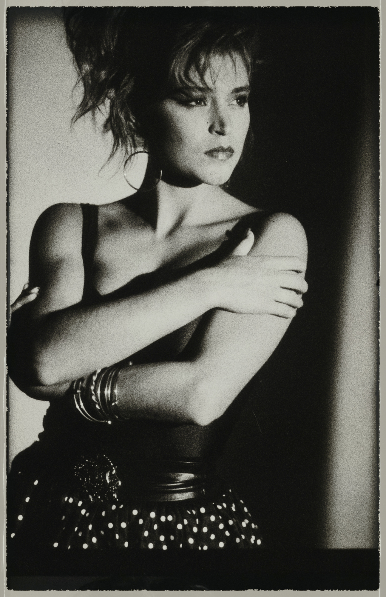
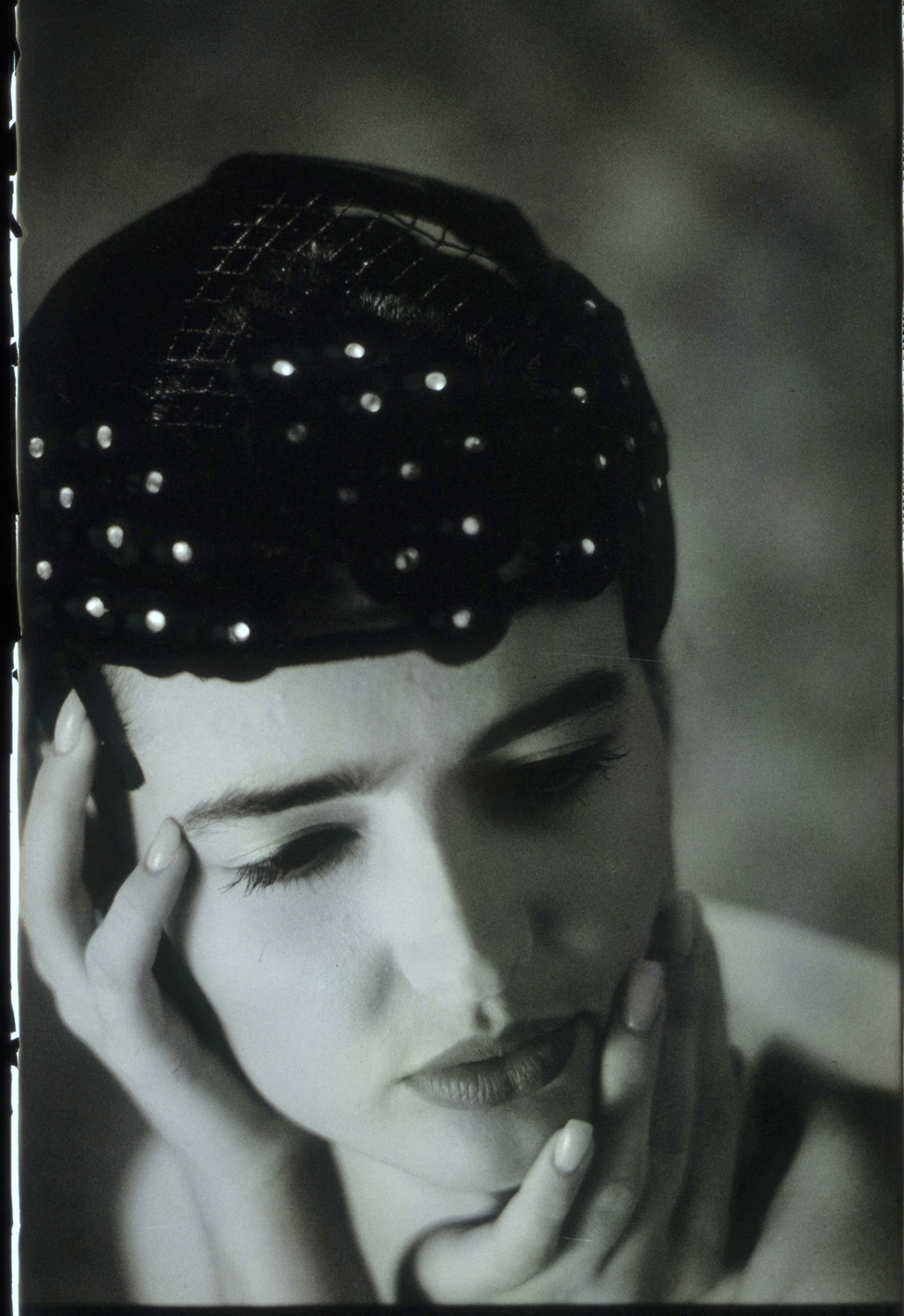
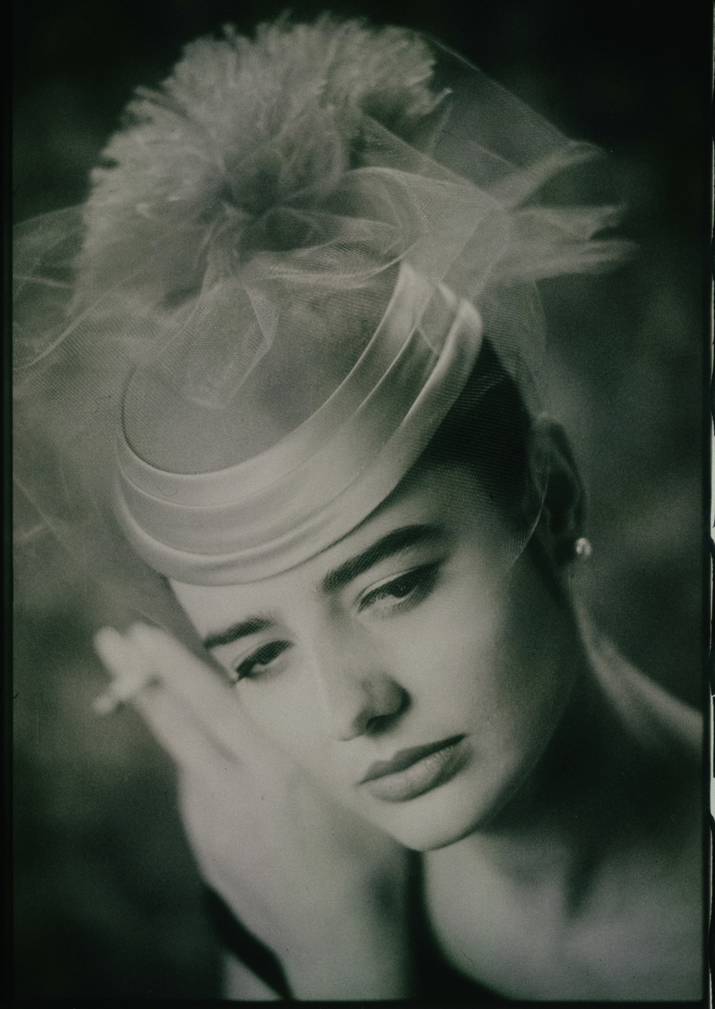
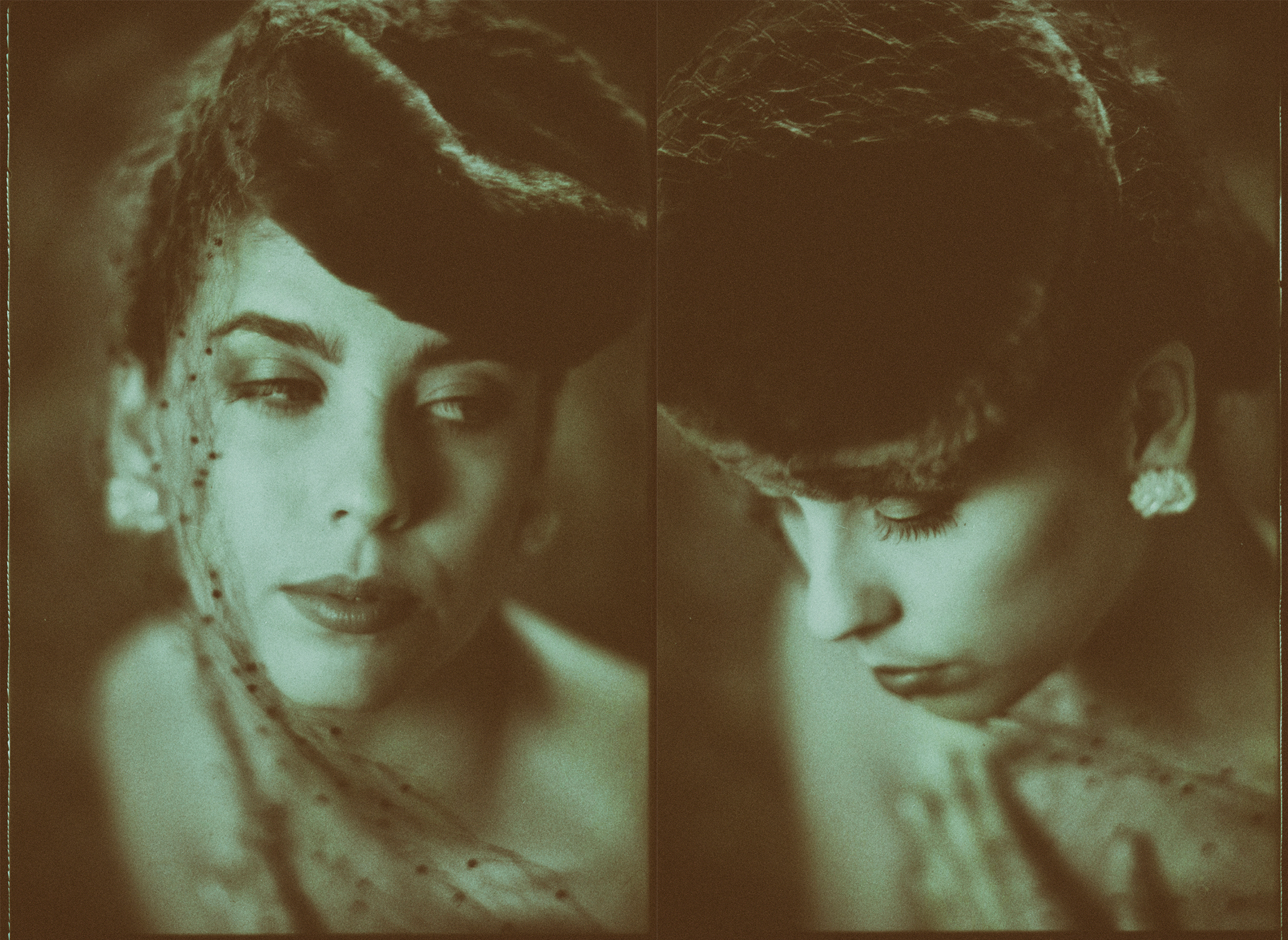
POLAROID PORTRAITS CA/ 1985
One of my favorite films... but it is now gone.Back in the mid ’80s, I was shooting a lot of fashion and beauty work in my Phoenix studio, and occasionally in New York and Chicago. Those were heady times with shoot schedules coming back to back for weeks and months at a time.
My work at the time was mostly focused on black and white or monochrome, and I would shoot hundreds of rolls per week. This meant, of course, that I had to have a full-time darkroom assistant whose main job was to develop, contact print, and manage a lot of film. We used glassine holders, and archival sheets designed to hold negatives and would allow us to make contact sheets without exposing the film to the elements.
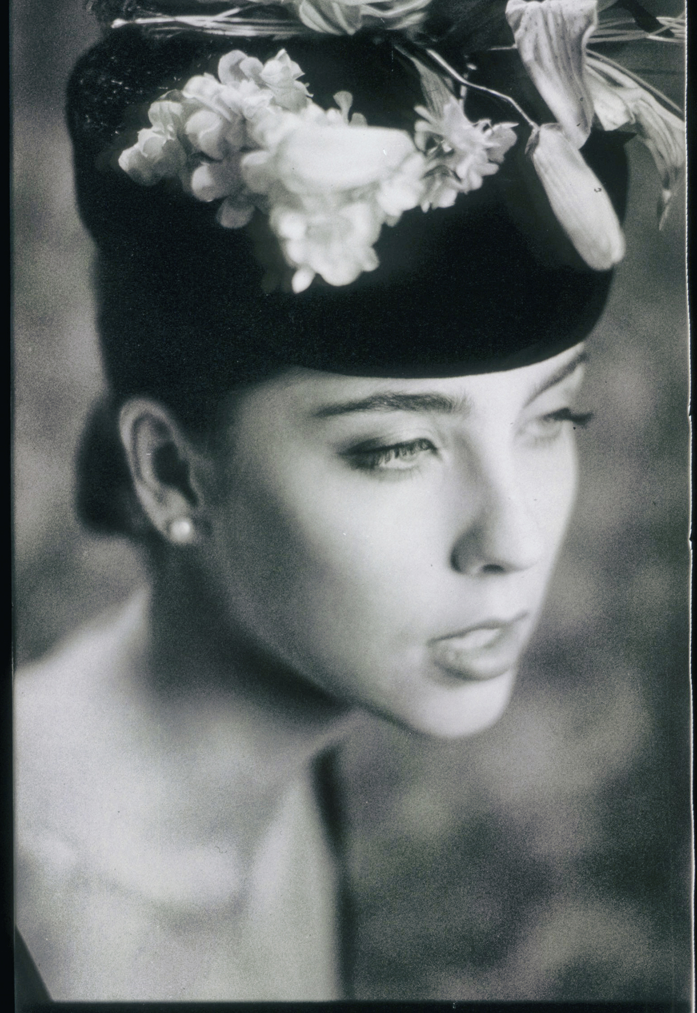
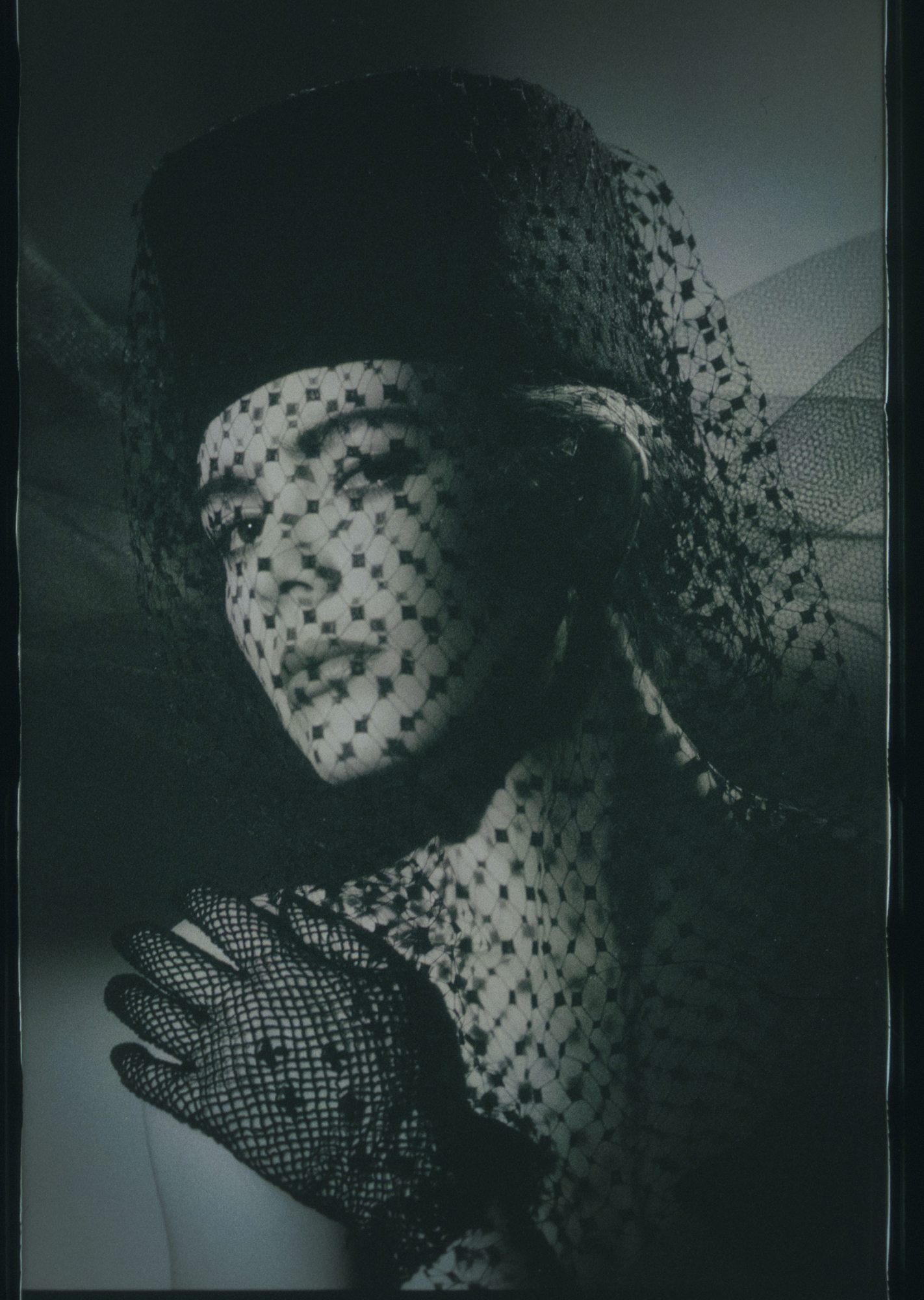
Around that time Polaroid came out with a very cool film. Well, at least I thought it was extremely cool. It was called Polapan. It was a black and white transparency film that you could develop instantly… and it was gloriously awesome.
This film had a tooth to it, a grain that was unlike any other. It was contrasty, yet very lovely through the mid-tones. It didn’t look like TriX or Plus X. It looked like its own presentation.
And to be sure, this stuff was a pain to handle. You had to buy a developing tool that would wind the film into the dark through the developer cartridge. You would let it sit for the required few minutes, then roll it back out of the little device. And it would still be wet, and fingerprints would show.
It would also scratch if it touched anything in the real world. I think it would scratch if you even thought about it. I would hang it in dust-free areas, or in bathrooms full of steam so as the steam settled the film would dry without dust.
If I was shooting in the field, I would wait — well usually — until I got back to the studio to develop. I did this myself, not the studio assistants. I would be responsible if it was damaged or scratched, not an assistant who would feel bad about doing it. If anyone is going to FIU, it would be me.
I shot roll after roll of this stuff. I loved it.
The images here were from outtakes for an assignment on antique hats* and these are scans from prints.
Ahh… prints.
These are transparencies, so if I wanted a print, I would have to get a “Type R” from the lab (a color process that made images from transparencies) or use a slide duplication tool to get a capture on traditional black and white film. This was not the ideal way because I would introduce Plus X grain into the Polaroid grain. I wanted the look and feel of the Polaroid to stand out.
The answer was Cibachrome.
I would use Cibachrome to make the prints, and since it was a color paper I could introduce slight tints to the images through the enlarging process. A very light blue paper that once wrapped around a cigarette pack, or some cellophane that had yellowed with age. I tried so many things, then cataloged them in manila envelopes for continued use.
As I noted earlier, most of my work was in monochrome. In fact, my entire portfolio was monochrome… not necessarily black and white, but decidedly two-color. I would bleach, color tone, split tone, and use specific toners like Selenium at varying strengths to add a very slight color to my prints.
I miss those days. But I love my digital cameras as well.
As you can see, even back in the 80’s I was trying to find ways to stay out of the darkroom — although without much success — and Polapan gave me the ability to do just that.
All images shot on a Nikon F3 with a Nikkor 180MM f2.8 lens on Polaroid Polapan and developed normally.
- NOTE: the top image was not for the hat assignment, but I put it in to show that when I say the 80s, I meant the 80s.
Thanks for reading.
Gatorade’s Campaign for Exclusionary Positioning
Gatorade Tells Huge Demographic to Get Lost This is a very interesting commercial. They are actually telling a large demographic that they do NOT want their business. If you aren't someone who works up a sweat, their product is NOT for you. There are a hell of a lot...
Visuals Can Be Currency
Andrew Scrivani is a food photographer in NYC. He has noted a trend among marketers that shows how powerful they regard visuals. "So, this latest, most disturbing turn involves a PR company calling me to ask if I would do a “takeover” of their Instagram feed for an...
Big Images on Websites: The Truth
From the article on Crazy Egg: "It is easy to see why this is becoming a regular practice among websites, it gives your site a very sexy look. A good looking website is one of the first aspects of your site that your visitor responds to, both consciously and...
Are You “Wandering”?
It's all good. Sometimes what others see as wandering is really us looking at all the different paths.
Will “Native Advertising” Become More Powerful for Small Businesses?
What is Native Advertising you ask? Let's explain it this way... an ad that takes the form of something native to the site it is being shown on. An example: A regular ad would be something like a banner for an accounting firm placed on a community page. It may be a...
An Old Acquaintance Died Yesterday, RIP Dude
Stock photo from the stupid CC collection at Flickr. A friend died yesterday. Well, not really a friend, more of an acquaintance really. We never did see eye to eye on what my friend's real goals were. Oh, I hung around him for a few years. Coffee. Lunch now and then....

