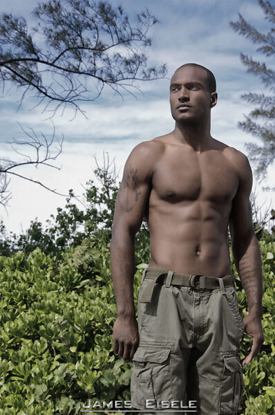
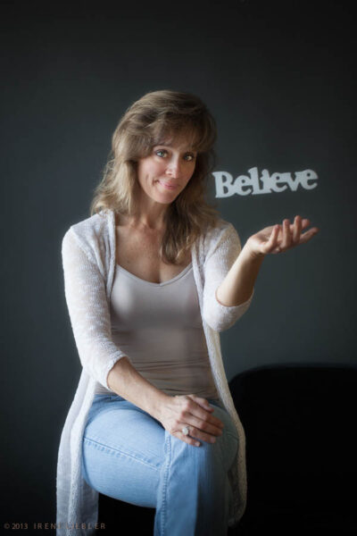
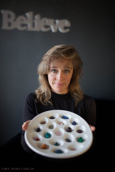
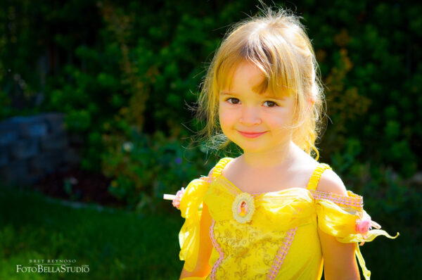
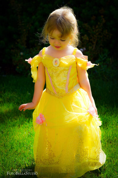
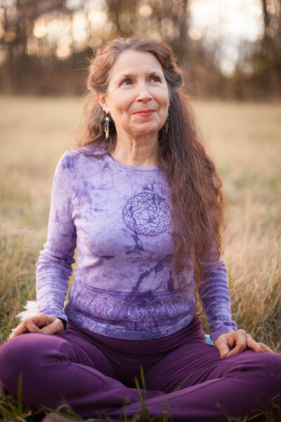
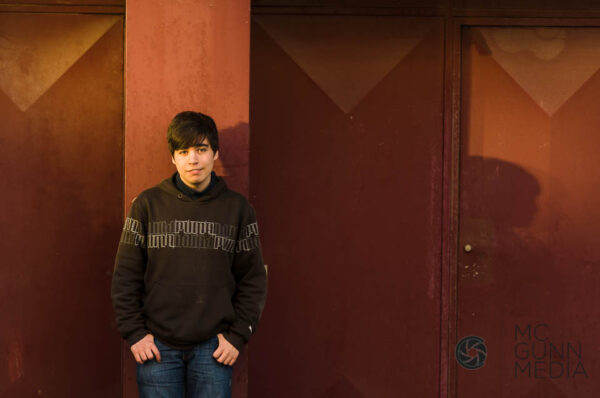
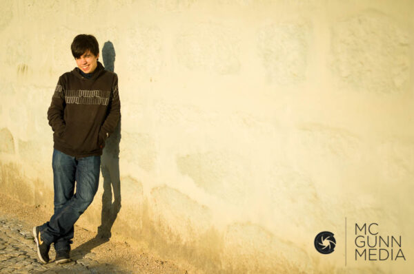
A NATURAL LIGHT PORTRAIT
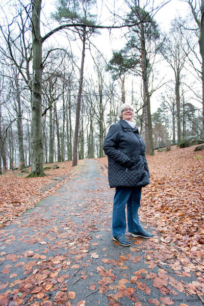
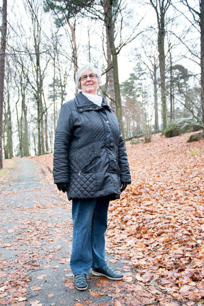
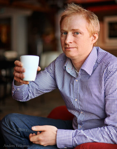
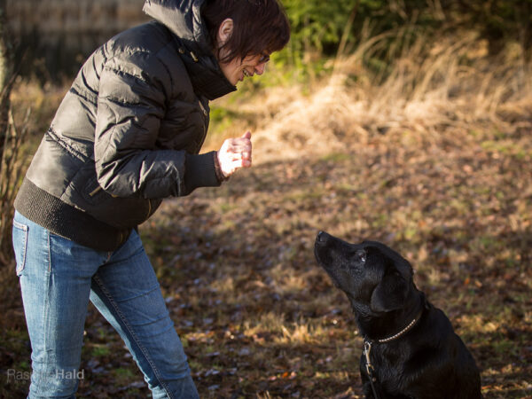
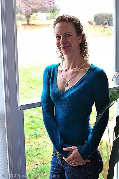
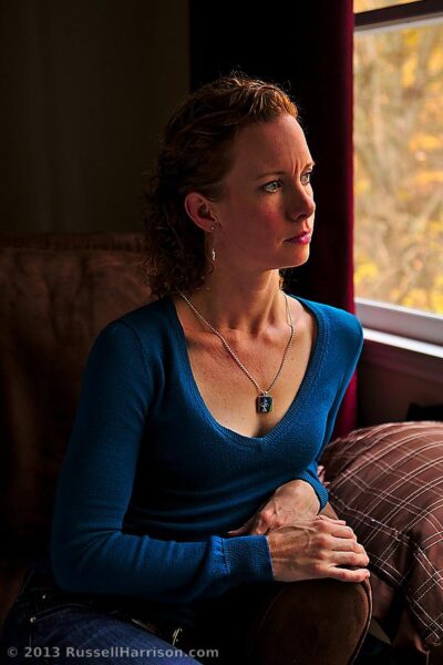
A simple Natural Light Portrait
… but not a headshot, glamour shot, or JC Penny portrait. I want a genuine portrait of someone in soft, gentle, hard, bright, killer light. You choose based on what you love and your style.
I do not want to see a head and shoulders portrait, so a half / three-quarter / full portrait is good.
Keep the light as flattering as possible – and please use fill cards, mirrors, or shiny boards if you need some extra punch.
Some things to also consider… the portrait will be used in a full-page magazine editorial that discusses a lifelong search for a reason we exist. It is a metaphorical article full of all kinds of mysticism and religion and science. So everyone is covered.
The art director wants a portrait of someone to put in the article, and he wants it to be someone approachable.
“An everyperson approach”, he explains, “Not someone glamourous or over the top… someone we feel is real.”
Northlight? OK!.
Direct sun? Absolutely.
Scrim? Sure.
Shadow area with bounce cards for some added punch – yep.
Backlight with blown highlights and sky? You betcha.
I want you to make two photographs… two versions.
Not two totally different takes of the same pose, but two different and unique approaches to the same portrait.
Two images that rock… not one good one and a throw-away second image.
Maybe smiling and not smiling or sitting and standing or one in the shade and one backlit. Variety.
Take a lot of time to figure this one out. The use of added light is not allowed unless it is bounced or filled in from boards.
One kind of light that will not work is fluorescent or ‘store’ light unmodified.
Please don’t accept crappy light as the only option.
Move them to a window, add a fill board, take them out back, and use a shiny board to add a bit of directional bounce.
Just not a ‘grab shot’ in a kitchen or living room.
I want to see the thought process working.
P52 LEGACY ASSIGNMENT TWENTY THREE: ADVERTORIAL
A Three Shot Advertorial (Assignment 22) Advertorial Explanation Word Origin noun 1. an extended newspaper or magazine text advertisement that promotes the advertisers product or services or special point of view but resembles an editorial in style and layout. ...
P52 LEGACY ASSIGNMENT TWENTY TWO
Cosmetics can be a tricky subject for a lot of reasons. The design of the packaging and tools are extremely important for the branding of the items. Logos, shapes, colors, textures, and more are carefully worked and reworked to help the customer feel the experience of...
P52 LEGACY ASSIGNMENT TWENTY ONE
A Flatlay shoot for a consumer magazine. BRIEF: Three themed images for an article based around how the summer changes the home, and the environment within. The assignment is based on an article in Magnolia, Fall, 2022. Consider this a study in composition, structure,...

