A Flatlay shoot for a consumer magazine.
BRIEF:
Three themed images for an article based around how the summer changes the home, and the environment within.
The assignment is based on an article in Magnolia, Fall, 2022.
Consider this a study in composition, structure, and texture. Dimension is not an issue now, in fact, the very idea of a flatlay is to decrease the idea of dimension and present the objects as graphical symbols, designs, and shapes.

You will notice in the examples given there is ample space around the image to let it breathe, and that empty white also focuses the attention on the composition in the middle of the page.
Short, but prominent shadows give a little bit of dimension by pulling the items off of the page, but there is no over all dimension to the images within the space.
That much whitespace eliminates context, and makes the background simply a container for the items we want to feature.

In the spread above, we are only concerned about the image on the right side. The images on the left add a bit of fun to the text, but are not consequential to the main image. Sort of a still shot B-Roll – something to augment the text, and give some visual color to the layout.
This main image shows how pronounced the shadow is, and also gives us a good idea of direction and placement (angle to the subject). It matches the first shot and because of the edge of the shadow (transition from shadow to true value (white) we can tell it is a bit smallish light source. The shadow has a pronounced edge.
However – we can also imagine a medium or large light source farther away to allow the white surface to have no fall off, or subtle gradient.
The closer the light to the subject, the faster it falls off. Inverse Square Law. So in order to have it fall off gradually, we move the light farther away.
And as we move it farther away, it creates a more distinct shadow line.
Photography is a tradeoff world. We give to get.

In this image (left side) we can see the effort that went into the composition. The careful angles of the letters and cards vs the straight, linear look of the wheat stalk, for instance. Also notice how the items go from big on the bottom to very small on top. Adding the two pieces of fruit makes the composition a welcoming tool for inviting the typography to tie it to the text.
Opposite page has more B-Roll – but notice something about all the B-Roll shots. They are NOT flatlays (excepted the cook shot at top left). They show dimension, angle. POV. This helps break up the static flatlays which are the feature.
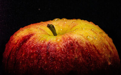
P52 LEGACY ASSIGNMENT SEVEN: THE ONE WITH THE APPLE
An Apple A Day... That's our focus in this assignment. “Apples” or a single apple. A bushel basket of apples. Ingredients for caramel apples, or cinnamon apple sauce. The old saying “An Apple a Day Keeps the Doctor Away” is the theme of the food magazine spread. And...

P52 LEGACY ASSIGNMENT SIX: THE ONE ABOUT THE MAGAZINE PORTRAIT
An environmental portrait? It's more than just a person in a picture. It's about context. It's a shot where the surroundings tell a story about the subject. Their life, their work, their passions. This isn't about studio backdrops. No, no, no. This is about their...

P52 LEGACY ASSIGNMENT FIVE: THE ONE ABOUT HANDS
ASSIGNMENT: CREATED BY HAND Our project is to create a photograph of hand/hands for a magazine article: “The Handmade Economy” and how handmade works are becoming a major new industry growing in cottages and homes and small businesses all over the country – but...