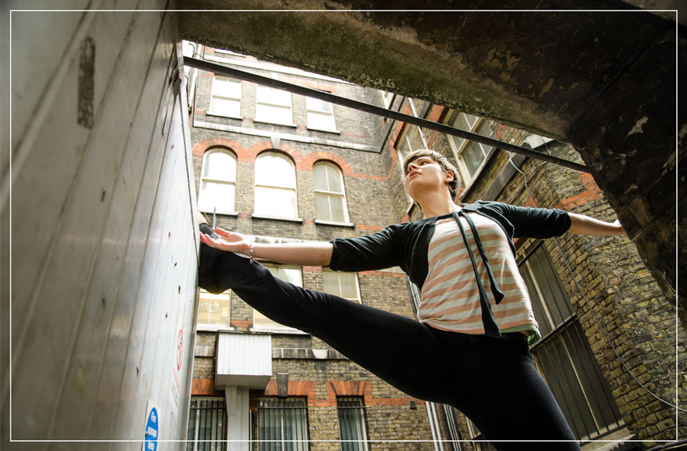
An environmental portrait? It’s more than just a person in a picture.
It’s about context.
It’s a shot where the surroundings tell a story about the subject. Their life, their work, their passions.
This isn’t about studio backdrops. No, no, no.
This is about their habitat. Their environment. Their space.
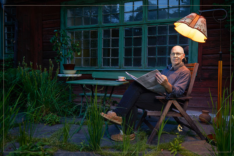
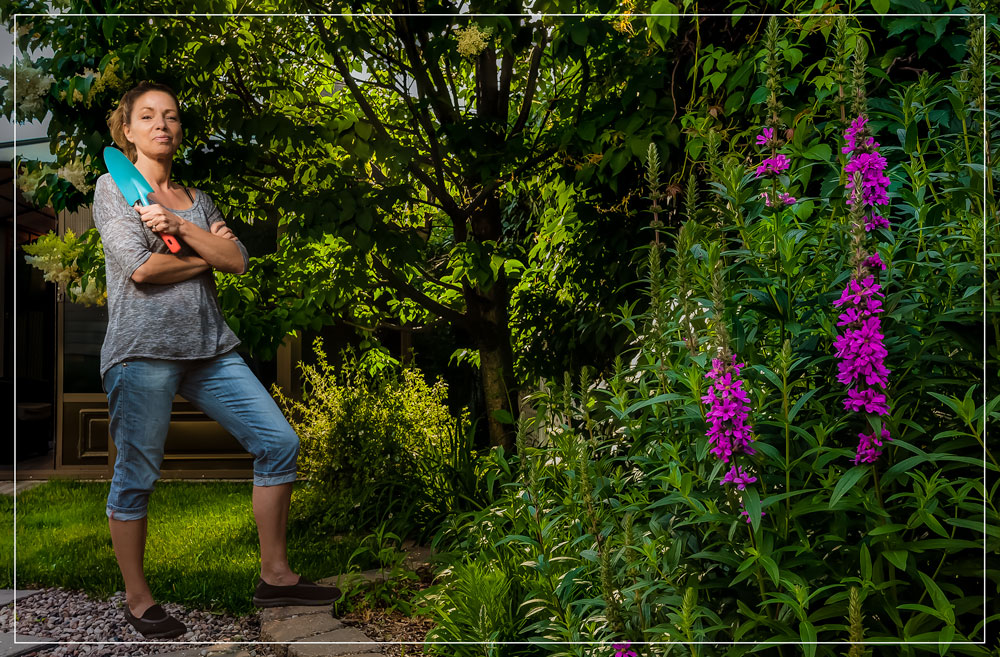
It can be a mechanic, grease-streaked, in a busy workshop.
A writer, surrounded by mountains of books.
Or a chef, right in the heart of a bustling kitchen.
The environment acts as a secondary subject. It reinforces who the person is.
It’s about capturing essence, character, lifestyle.
It’s about storytelling.
Remember, lighting is key.
Natural, available light or strobes, the light should help tell the story.
Observe, consider your angles. How does the environment complement the subject?
Interact, make your subject comfortable. Genuine expressions are gold.
Be patient, be creative, be curious.
The power of environmental portraiture lies in its authenticity.
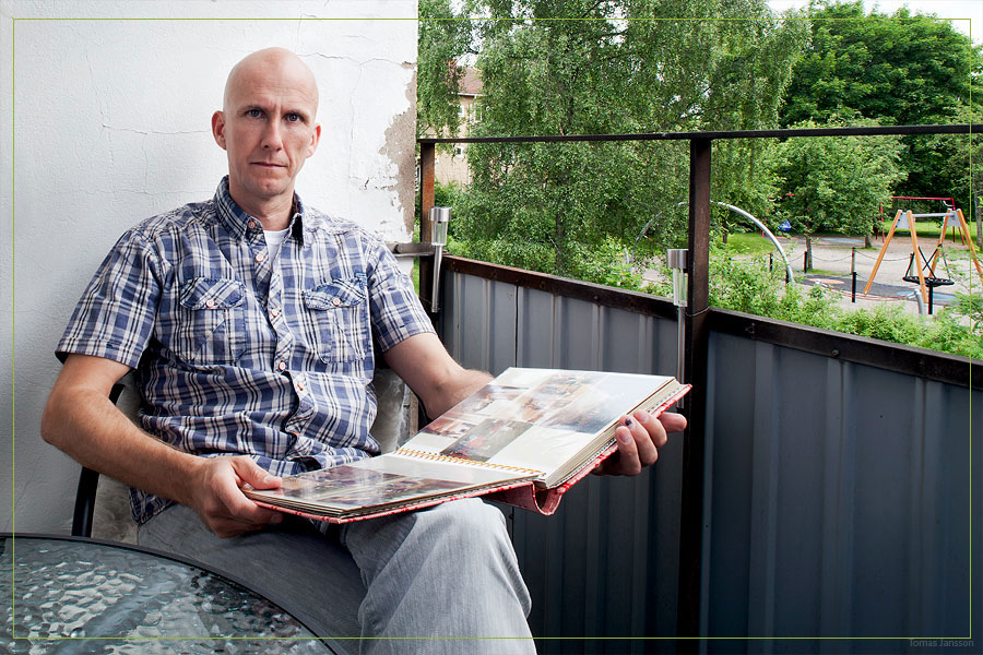
This environmental portrait is to be used as a “double truck”… which means it goes across both pages of a magazine.
It may also be called a “spread”.
That means we have to be concerned with four important areas:
- The bleed. That is the area at the edge of the image that must be controlled so that important parts of hands or legs or such are not cropped out of the image when it goes to the edge. And it also means we must provide a bit more image area than the layout calls for so it can be trimmed off the edge of the magazine pages. Usually, a quarter inch all around is good, so if you want it in the photo and not sitting right on the edge of the paper, you should leave some room at the edges of your frame.
- The format. Most modern DSLRs shoot either a 3:2 ratio image or a 4:3 ratio. Most magazines are not exactly matched to either, so we need to know how and where our image must fall to see it within the area of the magazine.
- The “gutter” or where the pages come together. This is a visible, very visible, line in the middle of the pages and you do not want anything of importance to be dissected with this crease or line.
- The text – Headline, intro text, and copy. Hopefully, the art director will be able to work with what you give them, but if you give them a highly complex, super contrasty background, it may be quite difficult to lay the text over the image.

You can see in the illustration just how important it is to KNOW your camera and how it will be seeing the image in respect to what that image will be used for. Shoot too tight and we have no room for bleed. Shoot too narrow and we may have problems with the gutter. And if we do go in too tight, and the AD has to blow the image up to make it fit, we can lose vital information at the edges of our photograph.
This isn’t to say that AD’s never blow up or mess with our images… that would be an absurd thought. They do. They will. We have to make sure we give them the best possible to start with, and they can then do what they do best. If we do not give them enough room, then they are not being creative, they are trying to fix a bad situation. Not something we want anything at all to do with.
Your Assignment is to do an environmental portrait.
It must fit within the spread, and it must be constrained to the 11×17 format.
1. Create a document that is 11.5 x 17.5 in Photoshop.
2. Add guides for 1/4 bleed crop on all sides.
3. Add a photo to the document.
4. Show the bleed area with a white or black line (2 pixels) on the guides.
5. The copy can go left or right as long as you leave the room.
This is the kind of practice that will prepare you for print work.
And you should all be prepared for print work… cause you are going to be grateful and get after those clients!
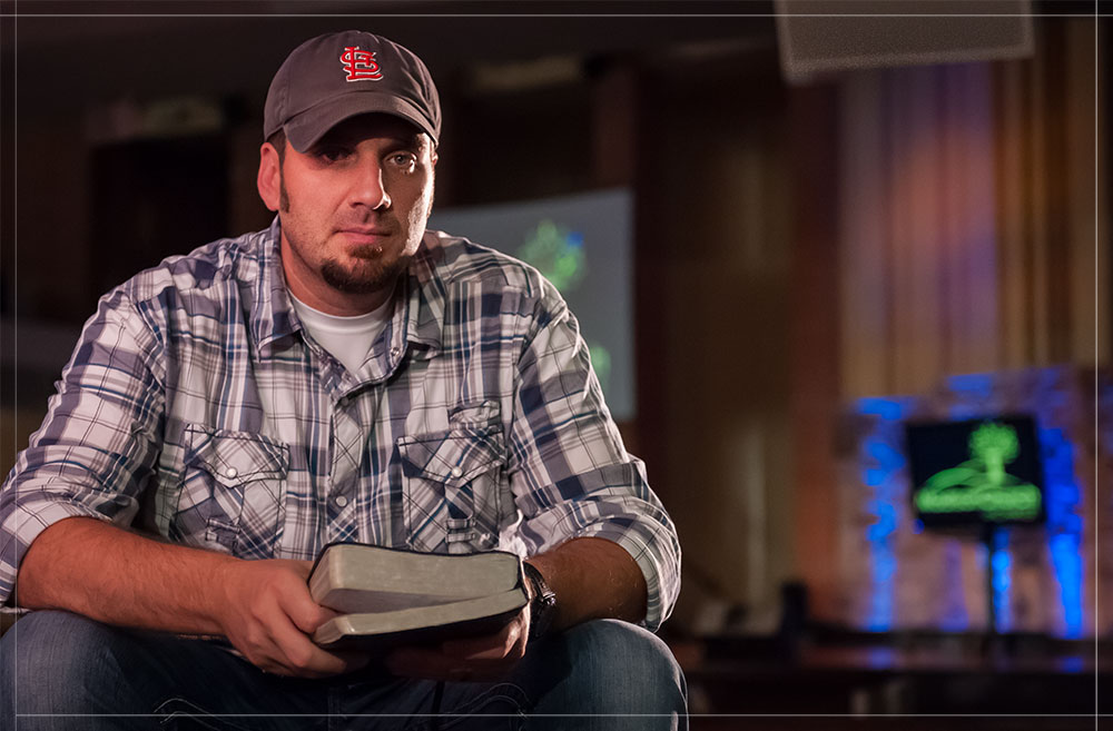
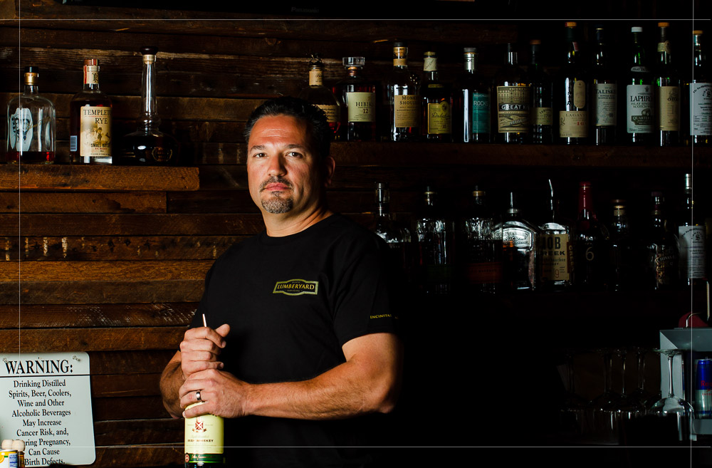
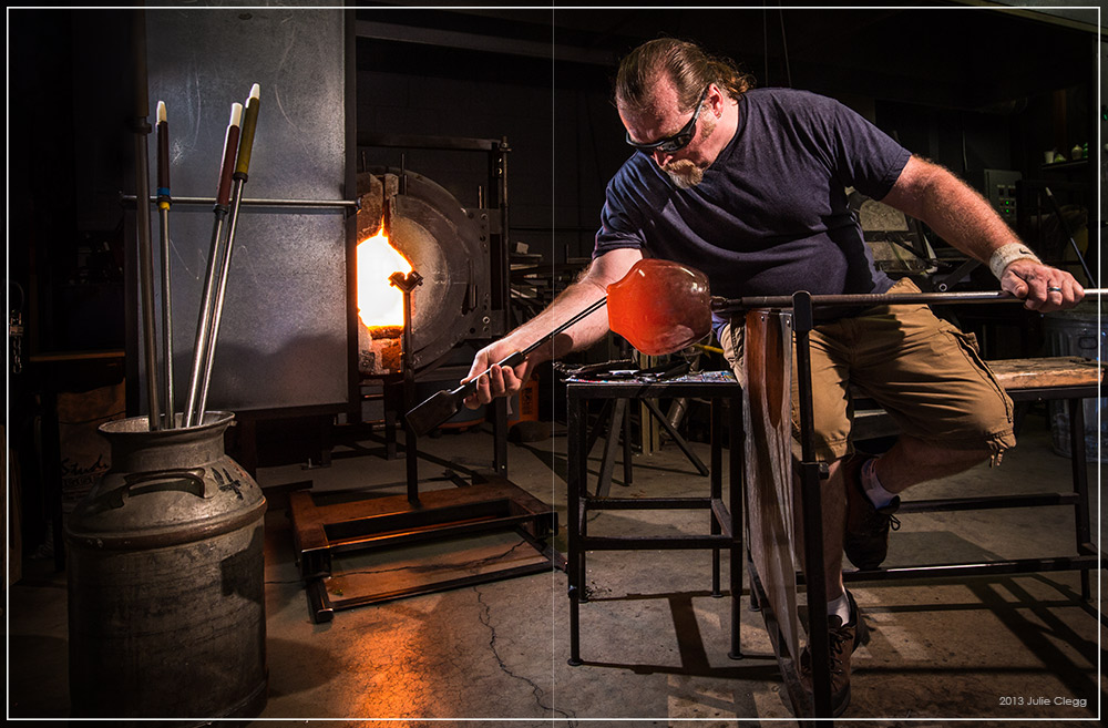
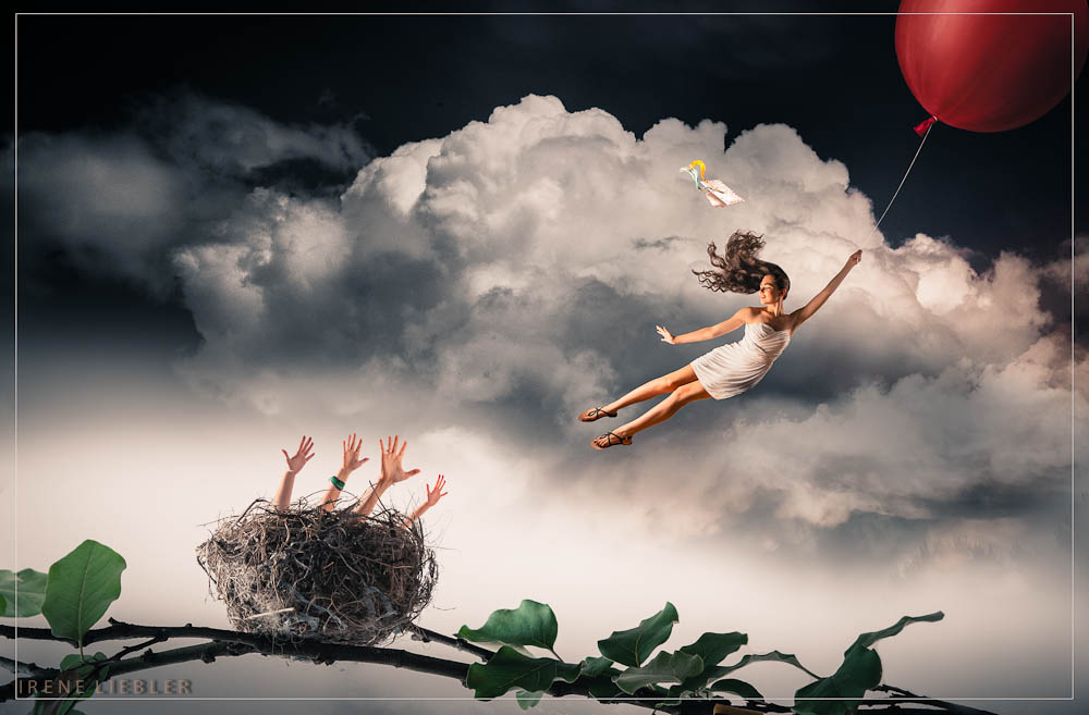
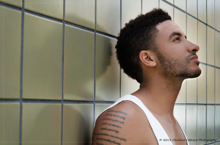
Student Images for Inspiration