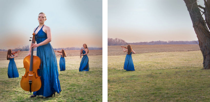
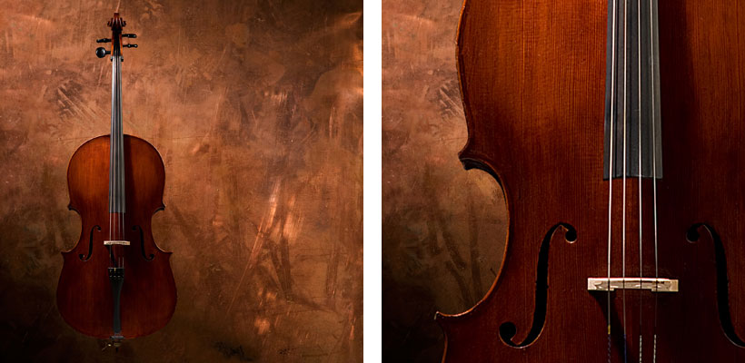
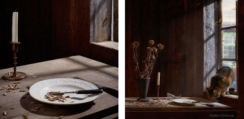
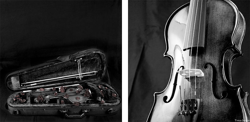
In this assignment, you will have to very carefully follow the brief(s) for the shoot.
The client is a small PR firm in your area, and they are handling the promotion of a regional classical music string quartet. The quartet is made up of University string teachers.
This is the first CD they have made and they are being looked at by a major label for possible signing.
Your job is to create an image for the cover/back that will do two things:
Show something regarding a string quartet and say a little something about the music.
{Before we continue… I do not care if you do or do not like the music. So please do not give that a consideration for sharing. You are a commercial photographer. You make pictures for a living – you are not a music critic. We do not have that luxury… to decide what we like or what we don’t like. We love our clients, and we work hard to provide them with what THEY need.}
So this is the assignment music:
Samuel Barber, Composer
The piece is Samuel Barber String Quartet Opus 11
There is a video below.
A fierce problem is that you may not have access to a string quartet. Or even a string instrument.
So how do you show music like this in a photograph?
Concept.
Google is your friend… Notice how many CD covers are there. Notice how not all of them have string quartets on the covers… or even musical instruments.
You are to provide the following:
Cover image – square format.
Back side image – square format.
Back image will contain the same elements as the front image.
Assemble them in Photoshop like this:
The images are to be 900 pixels square.
The composite is to be 820 pixels wide and 400 pixels tall. 20 pixels separate the two images. White is the separation color.
Do not “Design” the cover… no type or logos or such.
We are often given specific information and units and we are expected to deliver. If you are not sure how to do this, we will have to work you through the methods. Speak up on Flickr.
- Taken for a Project52 assignment.
P52 LEGACY ASSIGNMENT TWENTY THREE: ADVERTORIAL
A Three Shot Advertorial (Assignment 22) Advertorial Explanation Word Origin noun 1. an extended newspaper or magazine text advertisement that promotes the advertisers product or services or special point of view but resembles an editorial in style and layout. ...
P52 LEGACY ASSIGNMENT TWENTY TWO
Cosmetics can be a tricky subject for a lot of reasons. The design of the packaging and tools are extremely important for the branding of the items. Logos, shapes, colors, textures, and more are carefully worked and reworked to help the customer feel the experience of...
P52 LEGACY ASSIGNMENT TWENTY ONE
A Flatlay shoot for a consumer magazine. BRIEF: Three themed images for an article based around how the summer changes the home, and the environment within. The assignment is based on an article in Magnolia, Fall, 2022. Consider this a study in composition, structure,...


