ASSIGNMENT: CREATED BY HAND
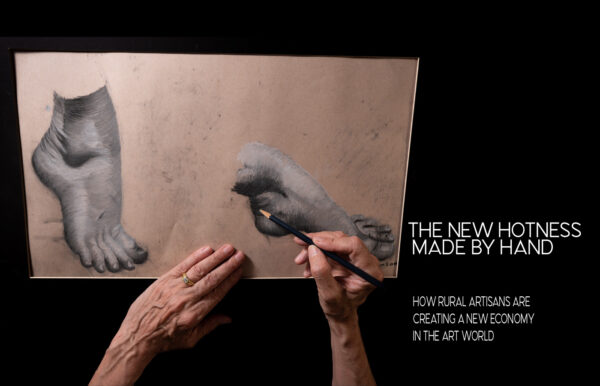
Our project is to create a photograph of hand/hands for a magazine article: “The Handmade Economy” and how handmade works are becoming a major new industry growing in cottages and homes and small businesses all over the country – but especially near where you live.
And this is a very hot niche, folks, growing exponentially in small towns and big cities.
RESEARCH:
A Doctoral Thesis.
Craft in America – a documentary approach.
Made by Hand: (I liked this book a lot)
Image search on Google.
Hands.
A few tips.
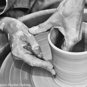
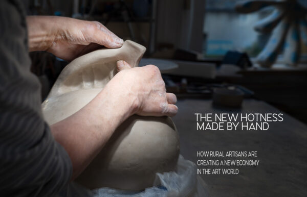
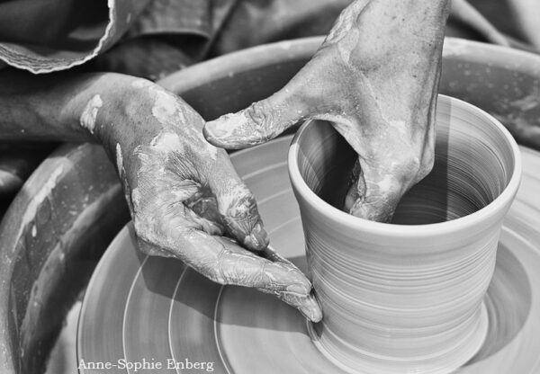
Pottery by hand
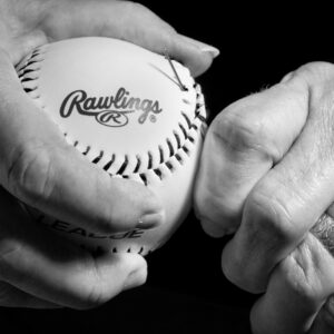
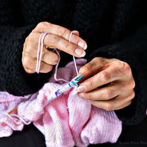
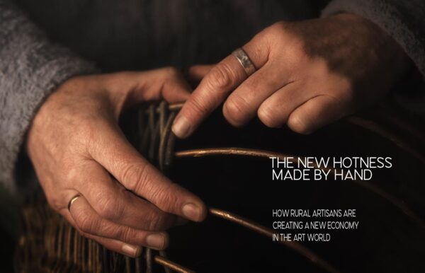
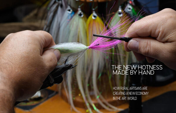
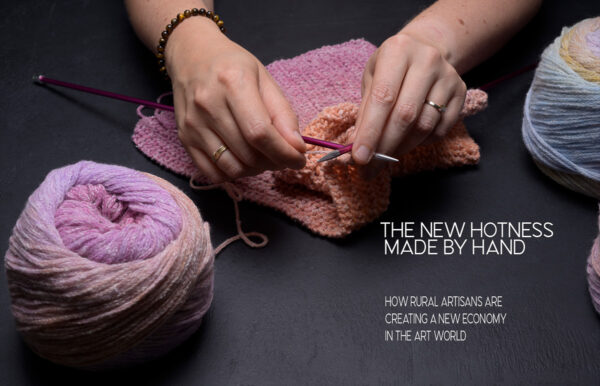
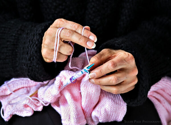
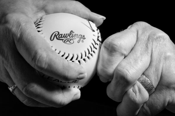
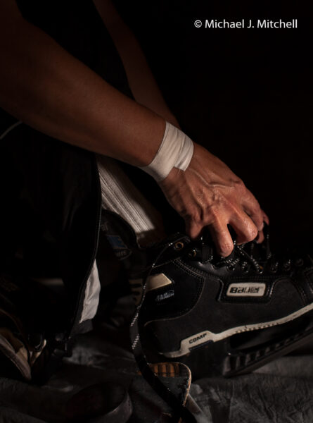
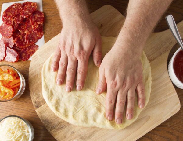
The approach you take is this: A handmade _____ “. Whether it is a guitar, hand-lettered note, a set of carved candle holders, a handmade iPad cover… whatever. The book will be about all sorts of “Made by Hand” items. Feature the hands prominently in the shot. Whether you shoot a child’s hand or an octogenarian, the point of the image is to express something about the maker – and the product – with the expressive use of hands.
From handmade drums to handmade garden tools to handmade furniture to handmade iPod cases – the proliferation of the craft of making something by hand is visible everywhere.
It may be a way of turning against the mass-created stuff or a return to the feeling that people make stuff for people. It may be that ‘one-off’ feel of something created expressly for them.
There are so many possibilities… and a good thing for us to think about for our own work, eh? The client is a direct one, no AD on this one. You shoot the image, they will wrangle in the type where they can. It may be a good idea to remember that there is some typography to leave some obvious room for it, but they are also happy with putting the type over a block of color.
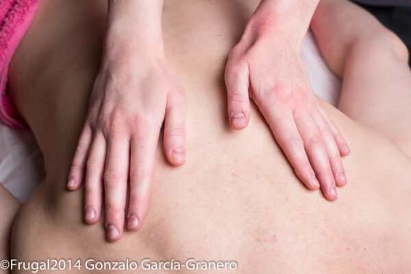
What the clients want to show is the spirit of handmade, and something very expressive with hands is called for. In fact, the image should be at least 30-40% hand(s) or more. No age restrictions on models at all.
Horizontal layout – landscape. It is a wide publication, so you must create the image to fit.
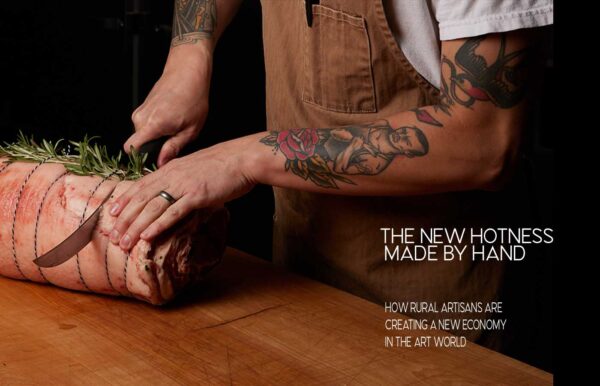
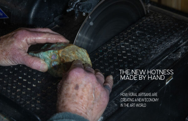
Here is the layout. madebyhand.psd-2
(NOTE THIS IS A NEW LAYOUT.
RULES:
You must use the copy as it is.
YOU MAY NOT MOVE IT – THE COPY IS IN POSITION, SO SHOOT AROUND IT AND REMEMBER THAT WHITE COPY WILL NEED SOMETHING DARK AND NOT VERY BUSY TO MAKE SURE IT IS READABLE.
You can use tools with the hands, or the finished item that was made. Or simply the hands working with the tools they use.
Remember the copy location as you are shooting. I recommend opening up the layout in Photoshop and moving stuff around to get a feel for the copy and what you may do in your shot to make it more readable.
LIGHTING:
Lighting is key here. We have to absolutely create a mood with the lighting. If you are using natural light, think about how you can modify the light to make the image you want. Fill cards, shiny boards, aluminum foil… lots of things can be used for creating a perfect shot of hands.
LENS CHOICE:
Be careful with DOF. If it gets too shallow, it could be a problem. Remember that images that are very shallow in DOF on screen actually appear a bit MORE shallow in print. Work to find the best DOF for the image, and perhaps do a few different exposures to create a selection for the client.
HOW TO USE THE PSD LAYOUT.
HANDS

